Project Black Libra
01Case Notes

A private archive of selected digital identity projects, decisions, and transformations.

These notes document the thinking behind selected projects — what needed clarity, what was out of balance, and how the digital identity was shaped.

Miami Corridor — Fintech / remittance experience / product identity
Case Note 01

Miami Corridor

Fintech / remittance experience / product identity

Visit Live Project ↗
01 · The Note

Making cross-border support feel clearer, calmer, and more trusted.

The Imbalance

Diaspora money movement often feels transactional, crowded, and uncertain — even though sending money home is deeply personal. Fees can feel unclear, delivery windows can feel vague, and payout options do not always reflect how recipients actually use money in mobile-first economies.

The Judgment

Build a Miami-based fintech identity around trust before speed, clarity before conversion, and dignity before financial access language.

The Shape

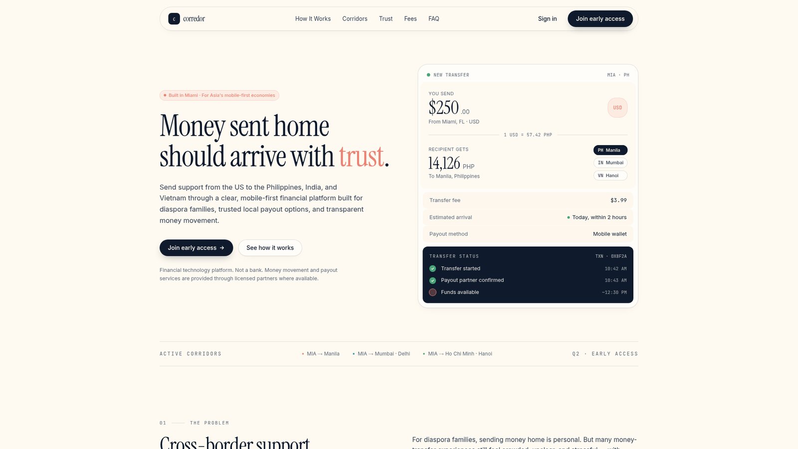
Miami Corridor was shaped as a premium remittance and financial access concept for US-based diaspora communities sending support to the Philippines, India, and Vietnam. The experience centers on transparent fees, corridor-specific payout options, calm transfer tracking, and a mobile-first interface that makes money movement feel less anxious and more assured.

Scope
  • Product identity
  • Landing presence
  • Fintech website direction
  • Corridor messaging system
  • Trust and compliance language
  • Mobile app concept direction
  • Transfer flow UX
  • Visual language
  • Early access conversion system
Linha Pedra — Construction / architectural identity / service trust
Case Note 02

Linha Pedra

Construction / architectural identity / service trust

Visit Live Project ↗
02 · The Note

Making construction feel calmer, clearer, and more considered.

The Imbalance

Construction websites often feel generic, loud, transactional, or overly dependent on stock imagery, hard-hat clichés, and basic service lists. For high-value residential, commercial, renovation, and restoration clients, the experience rarely communicates the level of taste, planning, communication, and trust required before a project begins.

The Judgment

Build a premium construction identity around precision, place, materials, and calm execution — positioning the company not simply as a contractor, but as a Portugal-based construction partner for clients who care about architecture, craft, and clarity.

The Shape

Linha Pedra was shaped as a modern Portuguese construction brand with an architectural digital presence: warm limestone tones, editorial project storytelling, disciplined service structure, tactile material language, and a process-led experience designed to make complex building work feel more organized and trustworthy.

Scope
  • Brand identity direction
  • Construction company website
  • Service page system
  • Project portfolio structure
  • Process and trust messaging
  • Material-led visual language
  • Contact and enquiry experience
Maison Miette — Hospitality / cultural food identity
Case Note 03

Maison Miette

Hospitality / cultural food identity

Visit Live Project ↗
03 · The Note

Making Belgian pastry feel modern, intimate, and quietly unforgettable.

The Imbalance

Pastry shops and cafés often fall into two extremes: overly traditional and tourist-coded, or visually polished but culturally generic. Belgian food culture has deep emotional and regional richness, but it is often reduced to waffles, chocolate, and souvenir aesthetics.

The Judgment

Build a contemporary café identity that treats Belgian pastry as culture, ritual, and craft — not just dessert. The experience needed to feel premium, local, editorial, and emotionally warm without becoming nostalgic or cliché.

The Shape

Maison Miette was shaped as a modern Belgian pastry café built around small rituals: Liège waffles warm from the iron, speculoos beside coffee, cuberdon-inspired choux, praline tarts, and giftable pastry boxes. The brand world balances European café restraint with tactile pastry craft, using warm materials, refined typography, quiet motion, and culturally specific menu storytelling.

Scope
  • Hospitality identity
  • Café website concept
  • Menu system
  • Cultural storytelling
  • Product naming
  • Visual language
  • Gift box direction
  • Reservation and ordering flow
Isle Roc — Creative studio / cultural storytelling
Case Note 04

Isle Roc

Creative studio / cultural storytelling

Visit Live Project ↗
04 · The Note

Giving Caribbean historical storytelling a cinematic digital presence.

The Imbalance

Caribbean history and Black historical storytelling carry enormous cultural weight, but they are often not presented with the cinematic ambition, design seriousness, and global legibility they deserve.

The Judgment

Build a studio identity that feels culturally rooted, visually ambitious, and capable of carrying mythic storytelling at modern internet speed.

The Shape

Isle Roc was shaped as a creative studio presence for short-form anime, historical storytelling, Caribbean worldbuilding, and visually powerful cultural memory.

Scope
  • Studio identity
  • Creative positioning
  • Project showcase
  • Cinematic brand direction
  • Audience-facing presence
  • Cultural storytelling system

Some projects may remain private or partially documented depending on the nature of the engagement.

04Enter Review

Submit a project for review.

Submit for Review